Tuesday 16 December 2014

Amazing Morph Update

On Wednesday 10th Dec I attended a talk at the Watershed in Bristol. It was a retrospect of the lipsync work made by Aardman 25 years ago. Weird because I'm 25 and it still looks as good today as it did back then, which is more than I can say about myself....
Anyway, I saw this as an opportunity to gift my knitted Morph to none other than Peter Lord himself, Co founder of Aardman Animations and creater Morph.
His reaction couldn't of been better, he even bought me a pint!
Peter shared a photo we had taken on twitter and a couple of pics of Morph and my work has been getting some major exposure from it, which is awesome. I am very greatful.
The night itself was a wonderful event and I got to catch up with my mentor Barry Purves which was lovely and I also made some new friends. I had seen all the films before on my Aardman classic DVD (which I originally had on VHS) but it was great to see them on the big screen.


Lendwithcare Christmas Animation 2014


Here is an advert for a really good cause.
I helped this project by customizing the little people.
I have worked with these puppets and Woodsfilm before you may recall on the vocality projects.
So they all looked basically identical when I received them and using milliput set about giving them all individual features, eg hair and bare feet.
I also created all of their costumes.
Check out the website to help the cause : http://www.lendwithcare.org/

Sunday 13 July 2014

Amazing Morph

In honor of the new Amazing Morph Episodes, out this month, from the iconic Aardman studios, I knitted a little Morph for myself,


 I gave him a full wire armature and even some bolts on his feet just incase I want to animate with him at a later date. I really enjoyed the challenges of this project like knitting a round shape for his head. I got an amazing responce when I tweeted these pics and it seems that Morph is as popular as ever.

Good luck to all that was involved, I cant wait to see the new episodes, im sure they'll be great,
 and Morph, good to have you back buddy!

DK Publishing Leopard Design

Thanks to the awesome people at Rumpus animation my work was scene by the equally wonderfully people of DK Publishing.
They were interested in commissioning  me to knit a couple of animals for the illustraions a new pre-school educational book.

The characters were an intellectual leopard, a fun creative monkey and a loving elephant.

We started with the leopard and I was asked to come up with a few designs based on a bit of refference material I was given. We talked about how we wanted to character to be quite toy like, cute and as original as possible. Here is what I came up with:


 I was playing with the proportions of the limbs and the length of the snout but we couldn't agree on what looked best.
I was sent a refference picture of some cat character designs from an artist they had found on google images. im sorry I cant tell who that person is because I dont know!
I didnt want to straight up copy this artists designs because thats not cool! So I drew over the designs to make the cat more leopard like and more original. The drawings with the round ears are my designs.
 At this point we were adding the proposed colours and I was still trying to make the character look like a toy. I was trying to discuss the joints and neck of the character but we couldn't come to a conclusion. So before I knitted anything I offered to show them a 3D felt mock up representation of the design of their choice which was this one at the top left of the pic below.
This was how it turned out:

 He has a wire armature inside to make him poseable. I designed the pattern myself which was the hardest part of the make.

 Unfortunately we still couldn't pin point what they were looking for so we drew a line under that project with a view to come back to it if they find a character design they all can agree on.
I guess thats the trouble with working with lots of creative people, we all have an idea of our own but its hard to merge them all together. I did learn alot about the whole design process from this project and got a chance to build on my sewing skills. I also used a bit of photoshop which is nice every once in a whille.


Friday 11 April 2014

Barry Monkey and Rumpus Animation

For my next knitted project I was inspired by Rumpus Animation's mascot Barry Monkey. A cheeky blue and purple chappy with a long curly tail.

I found a book of knitting patterns for nursery rhymes and in it was a domed shape pattern for a haystack. Using that as a base for Barry's body shape, I started knitting accordingly. And Barry kept growing. I didn't realize quite how big it was going to turn out.

My technique for knitting 3D characters is to break the character down into shapes. Thinking in terms of flat panels for front and back, or one big shape that can wrap around, like a net for a geometric shape.

I think I got the blue the right colour but maybe should of used a lighter pink for his face. But all in all I am happy with the likeness. I used card covered in felt to make the hat and felt again for his waistcoat and face details.


To make his tail I stitched wire into it whilst sewing it up. I coiled it up inside the body to hold it in place and hopefully stop the wire from slipping out.

My favourite part of this project was taking Barry to his new home. I hand delivered him to the wonderful people at Rumpus. They were all so complimentary and gave me some really good feedback on my work. I know Barry will be well looked after.


Tuesday 25 February 2014

Operation Knit To Impress

Well I am no graphic designer, so I dread sending my CV out on any occasion.
I feel a certain pressure in the creative industry to impress with a CV before it has even been read or the envelope even opened!
Recently I have been feeling that I have been overlooked for jobs that I have applied for and I put this down to the first impressions they must have got from my CV.
In this climate, employers get a huge amount of applications for every position, and standing out from the crowd is essential.
From a graphic design point of view I know that comic sans is a no go, but other than that I am sometimes at a loss. So I decided to keep it simple and take a different approach.
The work I have been applying for is mostly model making related so I have to showcase my skills on a 3D level.
I wanted to make it personal to each company, but I knew that I would have to be selective on who I focused on because of the amount of time and effort that would go into the application.

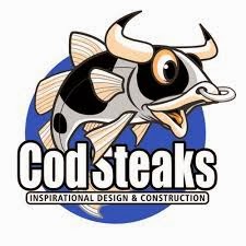
I chose the Bristol based studio Cod Steaks, not just because of their strong links to stop motion animation studio Aardman, but also because I might get the opportunity to branch out to other areas of model making, like window displays and points of sale etc.
What also caught my eye about Cod Steaks is their unique logo
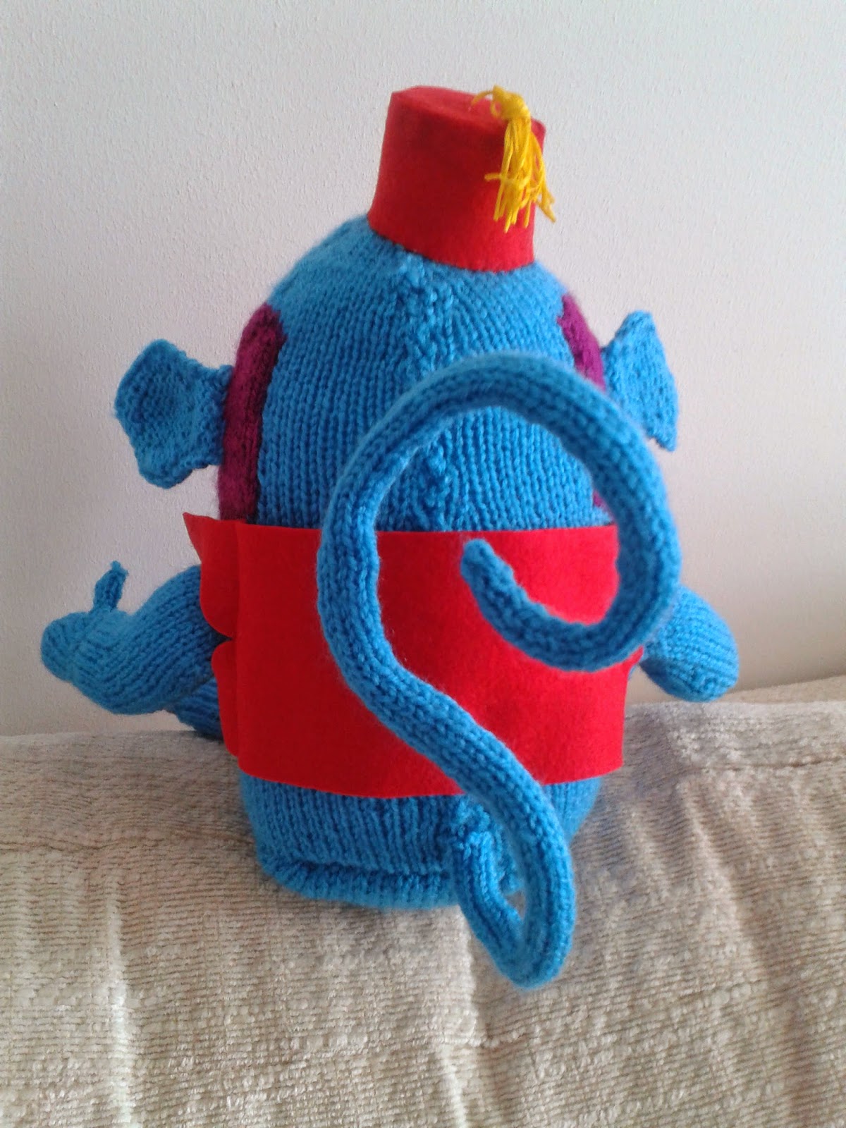
I took up my knitting needles once more and then had to put them down again soon after. I couldn't find a knitting pattern for a fish..... and definitely not one with horns.
So I made a visit to my Grandmas house and got inspiration from some old patterns for children's toys that she had stashed away.
I broke the fish down into shapes, a cone for its body and 2 flaps for the head.
It took a couple of attempts to get the black spots in the right place but eventually I cracked it!
And here it is:


I decided that the details would be sharper and look nicer if I made them from felt. I used gold thread to add detail and a bit of silver rope for for the bull ring.

I added the label with my twitter tag so that as long as it sits on someones desk, it will forever remind them of me and my work, and hopefully will make me top of the list when it comes to hiring new people.
I sent off the fish along with my CV, a cover letter and some postcard shots of my other work. I sent it just as a speculative application, there was no specific vacancy, and it wasn't long before I heard back.
I have had an amazing response from Cod Steaks, they were really flattered and are using the fish as part of a publicity campaign that you can get involved in on twitter, name the fish!
They have also told me that the lady that looks at CVs is on holiday at the moment but will give me a ring when she gets back. So watch this space.
My intention with this project was to create a buzz around my work so that in the long run it will open doors. Fingers crossed.


Sunday 5 January 2014

Paper Cutting

I have always enjoyed working with paper, (see yellow submarine post). I like the blocks of colour. and the layered texture you can achieve.
This time round I was inspired by Kirstie Allsop's hand made crafty program. I forget what it was called, but I do find it a good source of new techniques that I haven't tried.
This time it was Paper Cutting.
As I researched it a bit more I discovered how far it dated back and that it originated in China. Some of the designs I saw were so detailed and intricate it must of taken years!
These days you can see amazing examples everywhere, not just online but in places like paperchase on some beautiful cards.

For my first attempt I didn't want to over complicate it and just dip my toe. I also put my own twist on it by layering more than 2 colours.
I took my inspiration from Jules Verne's 20,000 Leagues Under The Sea. One of my favourite books so I decided to make a front cover for it.
I really enjoyed it, I think it came out great. The text was the most difficult aspect so good job there was only a little of it!